• Home
  • Blog
  • Contact Us
  • Author

Have any question?

+1(587) 821-5518
mjgeducation@gmail.com
RegisterLogin
MJG EducationMJG Education
  • Home
  • Blog
  • Contact Us
  • Author

PTE

Home » Blog » PTE-A Speaking: Describe Image, a difficult Bar chart and a Mixed chart

PTE-A Speaking: Describe Image, a difficult Bar chart and a Mixed chart

  • Posted by mjgeducation@gmail.com
  • Date November 14, 2021
  • Comments 0 comment

(please expand images approximately 200% – apologies)

A more complicated Bar Chart:

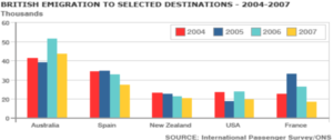
  1. This bar chart shows British Emigration to selected destinations from 2004 to 2007, which includes Australia, Spain, New Zealand, the USA, and France
  2. The most popular emigration destination was Australia.
  3. The least popular emigration destination was the USA.
  4. The average emigration destination was New Zealand.
  5. In conclusion, it can be predicted that Australia will continue to be the most popular destination for the British in the future.
  • Notice the change in superlative to ‘the most’ and ‘the least’; for some data this change is preferable.
  • Never speak about the y-axis; do not say/estimate/ or guess numbers as it is not necessary – just speak through 5 sentences.


The combination Bar Chart/ mixed chart where 2 graphs are on top of each other:


This is the only chart I know where two graphs are piled on top of each other. Further, this is a popular chart on the exam as many students tell me they ‘had this one on the test’.

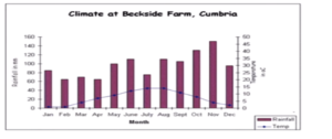
  1. This chart represents a line graph of temperature measured in degrees Celsius and a bar chart of precipitation measured in millimeters from January to December at Beckside Farm, Cumbria.
  2. The highest temperature was recorded in August.
  3. The lowest temperature was recorded in January.
  4. Precipitation fluctuated throughout the year with a high in November and a low in April.
  5. In conclusion, there is no relation between precipitation and temperature.
  • This is an extremely long introduction, the longest, but it is logical.
  • Do practice this type of graph ‘in reverse’, with the precipitation level or in a ‘U’ pattern for the year (temperature always rise and fall with the seasons, so they look the same)


  • Share:
mjgeducation@gmail.com

Previous post

CELPIP Reading: Introduction (chart)
November 14, 2021

Next post

ESL/EFL: Taxonomy of Listening skills
November 14, 2021

You may also like

PTE-A Write Essay: Introduction – The first 3 lines.
7 February, 2026

Introduction for all essay prompts: Line 1: An impartial or neutral background statement that introduces the topic. Line 2: Rewrite the prompt as a concession. Line 3: Write a thesis statement …

PTE Writing: Outline for all Write Essay Prompts
12 December, 2025

General Outline for Write Essay prompts Different Prompt types↓ Topic sentence 1st Paragraph  Topic Sentence 2nd paragraph Conclusion Advantages/ Disadvantages There are many benefits… On the other hand, there are …

PTE- A Write Essay: Double Question, Prompt 1
28 July, 2025

Introductory Paragraph Sentence 1: Write a “general statement” Sentence 2: Rewrite the question prompt in your own words Sentence 3: This essay will discuss Q1 and Q2 + opinion Paragraph …

Leave A Reply Cancel reply

Your email address will not be published. Required fields are marked *

Recent Posts

  • Duolingo: Task 3, Listen and Select
  • IELTS Reading: Task 11, Matching Features
  • PTE-A Write Essay: Introduction – The first 3 lines.
  • CELPIP Reading: Practice Question
  • Duolingo: Task 2, Read and Select

Recent Comments

    (+1)587 821 5518

    mjgeducation@gmail.com

    MJG Education

    • Blog
    • Home
    • Contact Us

    Copyright © 2021. MJG Education - All rights reserved.

    Follow Us

    Login with your site account

    Lost your password?

    Not a member yet? Register now

    Register a new account

    Are you a member? Login now